Why is data visualisation important?
Posted on: February 14, 2022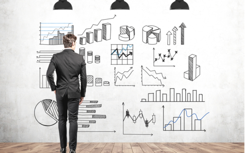
Data visualisation is a key element of data science. Thanks to increasingly powerful computers and their ability to aggregate and sort through any type of data, we have greater amounts of information available to us than ever before. Data visualisation is a means of presenting that information in a way that is easily understandable and actionable.
Business intelligence can only really be unlocked from big data through data visualisation, which helps us to gather and ascertain meaningful information from large data sets. A large part of data analysis is storytelling and yet we often absorb and mentally digest information better when imagery is involved. People remember 65% of the information that they’re shown in a visual compared with only remembering 10% of the information that they hear. Our eyes can quickly differentiate between colours and decode patterns – perhaps faster than they can be explained. This is why data visualisation is so important in sharing compelling evidence or predictions that the data can point us towards.
Edward Rolf Tufte is an American statistician considered a pioneer in data visualisation, who said that, “Graphical excellence is that which gives to the viewer the greatest number of ideas in the shortest time, with the least ink in the smallest space.” It’s a useful definition in understanding the purpose of graphical representations.
Data can be displayed in many different ways including graphs, charts, histograms, tables, treemaps, dashboards, or infographics. Some of the most basic visual representations that we all learn to create in maths class are pie charts, bar charts, and line graphs. More complex data visualisations include scatter plots, time series analysis, and heat maps. Scatter plots are particularly useful for identifying outliers as they are instantly recognisable as points plotted outside a highly concentrated cluster of data points.
How can data visualisation help in decision making?
Data visualisation really is key to making informed business decisions. A business can have a whole team of data scientists working on algorithms and gathering data but without data analysts working on the outputs, it is near impossible to draw any new insights of value. With data visualisation, we are able to present data in a way that can be persuasive and illuminating.
Managers who are short on time need to be presented with data that is easy to understand and conclusive. When it’s hard to decipher what the data is showing, it’s easy for decision-makers to lean on cognitive biases. Rather than scrolling through pages of data in Excel that use incomprehensible metrics, visuals help business leaders to instantly recognise patterns and understand the action that needs to be taken
Some of the best data visualisation tools for business include:
Tableau
Tableau is popular because it’s relatively intuitive to use and surprisingly powerful. It’s owned by Salesforce and also offers customer relationship management (CRM) software. The platform can integrate with and import data from hundreds of sources and offers dozens of visual representations to choose from.
A free version called Tableau Public is available to use, however, any visualisations created on this version are then available publicly. Tableau Public is therefore most useful for practising creating visualisations using data that’s not sensitive or private.
Zoho Analytics
Zoho Analytics provides a user-friendly platform that can help visualise data related to costs, marketing, sales, revenue, profit, and project pipelines. There’s a free version of Zoho Analytics that offers a limited number of reports so users can try it out and see if the templates it offers are useful for their needs.
Hubspot is a platform which is often used by sales and marketing professionals which has a similar interface to Zoho Analytics.
Google Charts
Google Charts is a popular option because it’s open source and free to use for anyone interested in creating interactive visualisations for websites. The platform can pull data from various sources such as Salesforce, SQL databases, and Google Sheets. Google Charts also uses HTML5/SVG technology (so no plug-ins required) to generate data visualisations, making it accessible to all. It offers 18 types of charts, including bar charts, donut charts, histograms, geo charts, and org charts.
Google users are free to create new charts and share them in a gallery on Google’s website. These charts tend to offer more advanced options, but bear in mind that they may not be HTML5-compliant.
Microsoft Excel (and Power BI)
Strictly speaking, Microsoft Excel is software for creating spreadsheets, not a data visualisation tool. However, it’s useful to know that it does offer visualisation capabilities. A commonly used function is an area chart, which is like a line chart with data separated by different colours. The y-axis is used to show increase in units, while the x-axis represents time. Other common options that Excel offers include bar charts, pie charts, bubble charts, radar charts, histograms, and treemaps.
For more advanced data visualisation, Microsoft created Power BI which can easily integrate with Asana to get real-time insights into projects and workflows.
Data scientists who are conversant in programming languages can use Python to create all kinds of charts and graphs. Simple stacked bar charts can be coded with Matplotlib, an extensive visualisation library for 2D plots of arrays, while interactive visualisations that use geospatial data can be made using Folium.
Visualise a new career with a master’s
Data science is helping us to understand the abundant information that can be gathered from many digital sources across practically all sectors. Utilising data analytics effectively provides valuable business intelligence and supports decision making at all levels. From charting the spread of Covid-19 across territories to understanding consumer trends, analysing our personal spending patterns to tracking our fitness and sleep patterns, the world of data can unlock insights that can change opinions and behaviours.
At a time when big data is almost becoming too big, data analysts and data scientists are key to helping businesses find the “right data”. Predictive data will also be vital in navigating the continued uncertainty of living in a global pandemic. Data science is no longer simply a subject area where mathematics, statistics, and computing converge but a respected specialism.
Find out how you can step up your data visualisation skills alongside many other in-demand credentials, with a 100% online MSc Computer Science with Data Analytics from Keele University.